- Do Words Good
- Posts
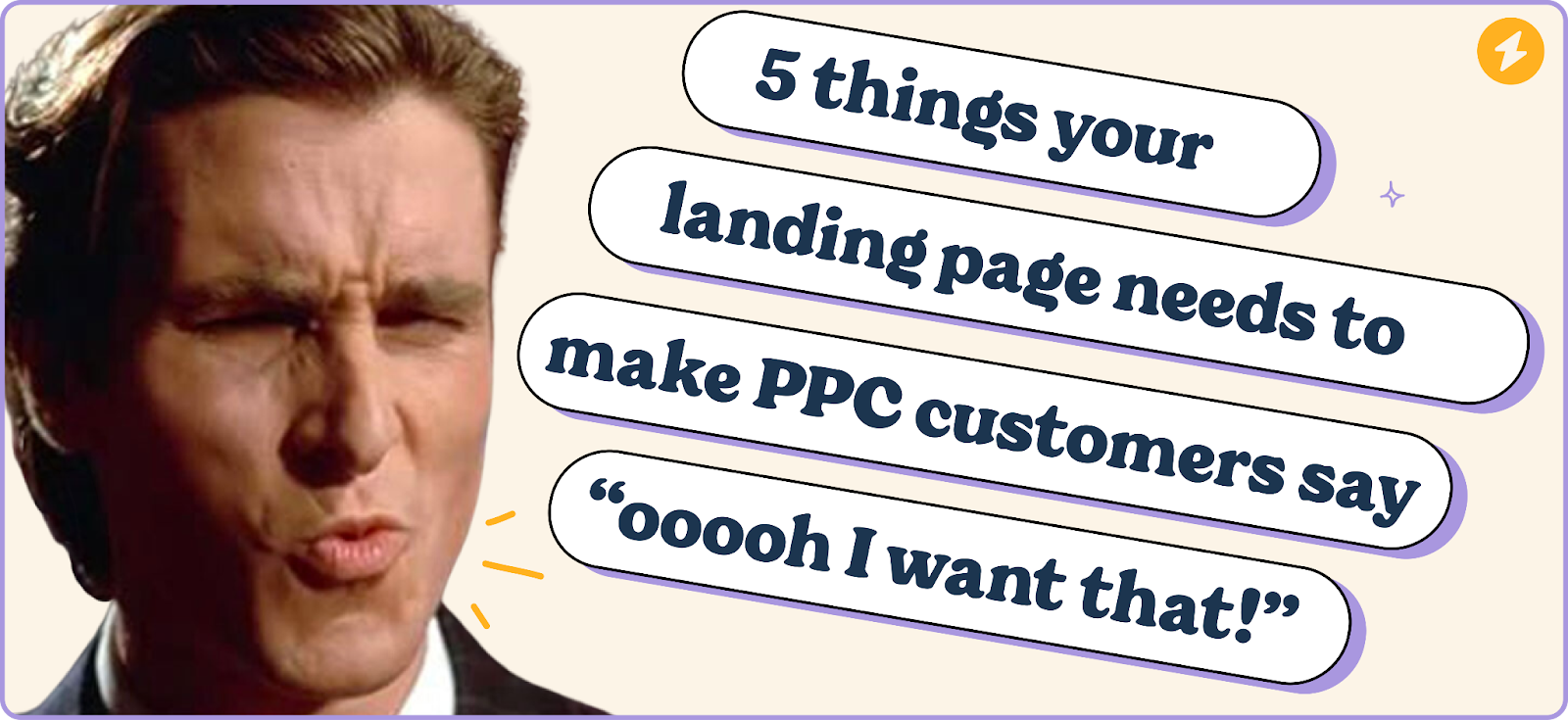
- 5 landing page elements you need before you spend a penny on ads
5 landing page elements you need before you spend a penny on ads
Do Words Good
September 16, 2024
There aren’t many better ways to get more eyeballs on your products than with paid ads. Whether it’s Google or social media, they’re pretty much a surefire way to get more people visiting your website.
Not only is it a good way to skyrocket your website traffic but the conversion rates for PPCs are 50% better than organic traffic.
But only if your ad landing page is up to scratch.
People aren’t going to buy your product if they click on your ad and don’t get what they’re looking for. So your landing page has got to be solid for your ads to really make a difference to your bottom line.
A lot of brands rush straight into paid ads with a barebones landing page to make a quick buck. They make some sales but they miss out on a tonne of opportunities and spend a fair bit to make the few sales they make.
But it’s not just the money being flushed away that’s the problem — a bad landing page stops people coming back to your brand later on.
So before you start calculating your ad budget and writing your ad copy, you’ve got to get your landing page up to snuff. Luckily, there are only five landing page features that you absolutely need to include and you’ve probably already got everything you need to put your own landing page together.
We’re going to use the landing page for the Maeving RM1S electric motorbike as an example throughout for a couple of reasons:
It’s a sweet-looking bike but there’s room for improvement on the landing page.
We got targeted by their ad and spent a lot of time working out if we could convince our partners to let us have bikes —we couldn’t.
1. Don’t make your customers scroll — give them a clear value proposition at the top of your page

One of the easiest mistakes you can make with a landing page is to tease your customers. If someone has clicked on your ad, don’t make them scroll and wait for the information they want.
Give them all you’ve got straight out the bat.
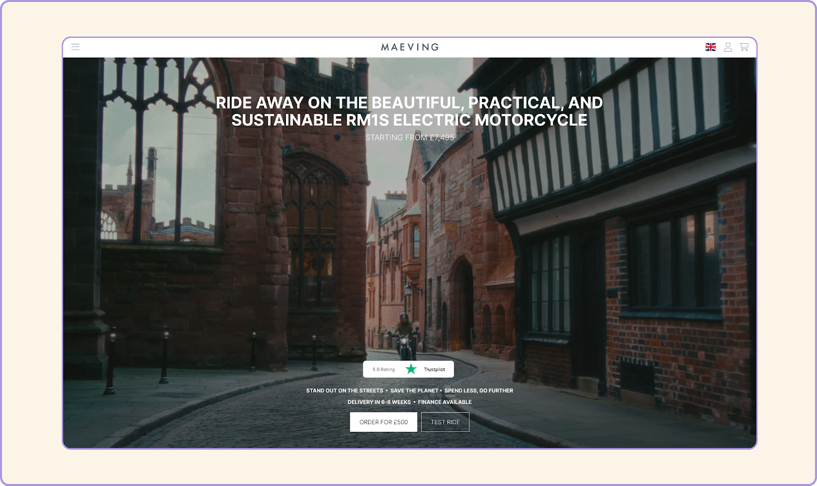
Most people that land click on your ad will only read about 20% of your page. That 20% is pretty much the hero section at the very top of your page.
This bit:

So you’ve gotta make it count.
And the only way to do that is to show people how your product or service helps them in your hero section. Give them a clear value proposition or unique selling proposition right at the top of your page. Give them a reason to buy from you and not someone else.
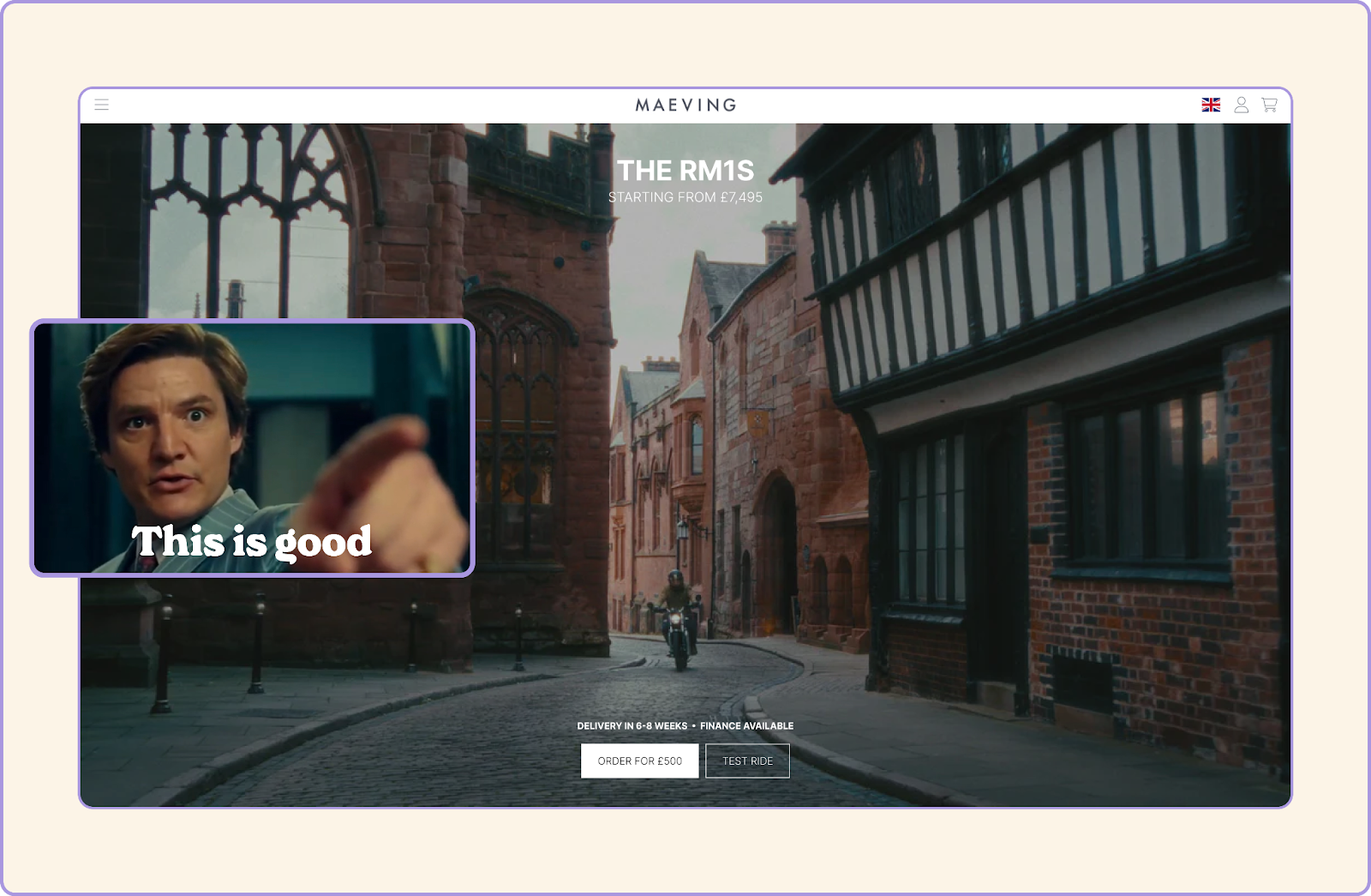
You’ve got to give them a reason to stick around and regardless of how good it is, your product alone isn’t enough. Just look at Maeving:
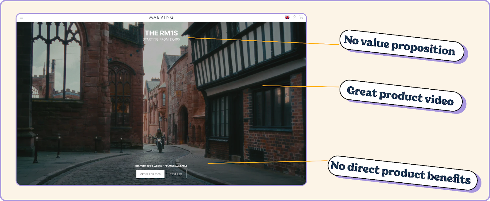
There’s a lot to like design-wise but it doesn’t instantly show why you should buy their bike over someone else’s.
Not only that but Maeving make electric vehicles which customers are more skeptical about so they can do way more to make sure customers don’t click that magnetic “X” in the top corner.
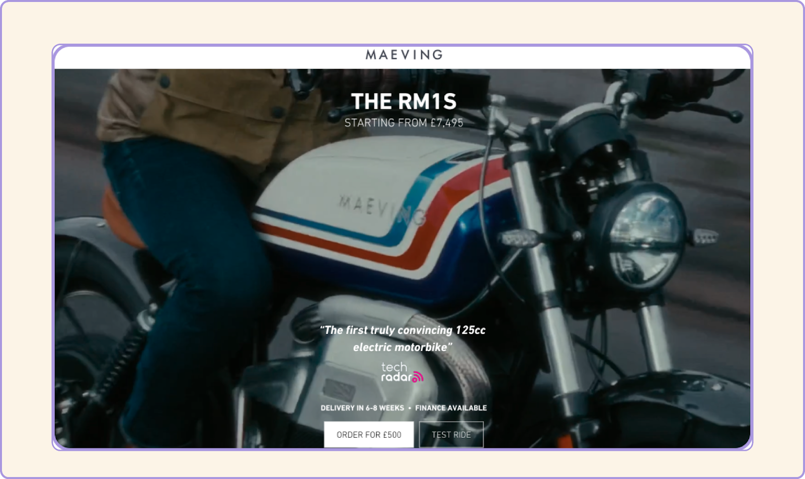
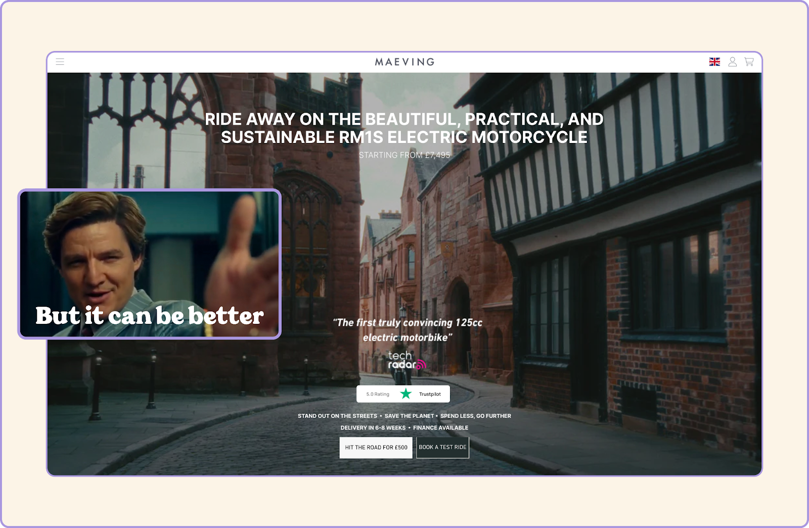
But throw in a value proposition into the hero section and it’s way more convincing:
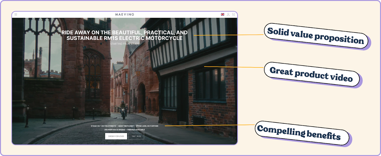
The copy we’ve added to the hero section is taken from further down the page and given a little tweak. We’ve just bought it front and centre.
It’s more convincing, addresses customer concerns and shows people why they should buy this bike and not one of Maeving’s competitors.
But you can’t just use any old value proposition.
Your landing page has to match up with the ad copy.
If your ad copy is saying one thing and your landing page is saying something completely different, it will confuse your customers and put them off buying or coming back later.
(Plus, you’ll get a low quality score, which means Google or Meta or whoever will choose to show your customers your competitors’ ads over yours.)
So make sure you’re consistent with your ad and your landing page.
Not only does it make your brand seem way more reliable but it makes your job easier. Lining up your ad and landing page means you can write the landing page and then tweak the copy into an ad in way less time than doing them separately 🧠
When you’re writing landing page copy, you’ve got to think about your audience a bit like a group of toddlers who question everything.
They’ll have questions about things you think are obvious.
And when you answer all their questions, they’ll say “Prove it.”
So do exactly that.
Think about your process when you’re buying a product. What’s the first thing you check before hitting that “buy now” button? Reviews, right? Maybe social media?
90% of consumers look at reviews before they buy something. Most of the time they’ll go looking on Trustpilot or Google to see what people are saying about your product or service.
Don’t make them go looking. Put that shit front and centre.
Look at Maeving’s hero section, how much more compelling does this little review widget make it:
But it doesn’t just have to be user reviews.
Maeving is a pretty new brand and doesn’t have a tonne of user reviews (or they’re very well hidden if they do). So a review widget like the one above probably isn’t the best shout.
But that doesn’t mean they don’t have anything they can use.
A quick look through their site and a look at search results shows there’s loads of stuff they can use:
Celebrity endorsements
Good professional reviews from recognizable publications
Sales figures
Customer feedback on social media
There’s always something you can use as social proof.
Maeving might not have thousands of Trustpilot reviews but this is pretty damn convincing:
Find something that proves your product or service is as good as you’re claiming and shove it right in front of your customers.
But don’t stop there.
Use social proof throughout your landing page. Whenever you make a claim or use a call to action, show that you’re not bullshitting your audience. Show them you’ve got the goods to back up your claims.
Social proof is proven to boost sales and brand awareness and the best bit? The more you sell, the more social proof you’ll have.
3. Make it easy for your customers to take the next step
One of the biggest stumbling blocks for customers when they land on a page is knowing what’ll happen next.
Tonnes of brands don’t give customers enough information about the next steps.
A lot of the time it’s because it seems obvious when you’re writing a page. As a founder or when you’re working for a startup, you know the ins and outs of your user journey so it’s easy to gloss over it on your landing page.
But your potential customers want to know what will happen after they hit your call to action.
If you’re selling products, that’s shipping time. If you’re selling a service, that’s next steps, onboarding call, etc… If you’re selling SaaS, it’s sign up and get started straightaway.
Maeving do a good job of showing the first and last step but not what happens in between:
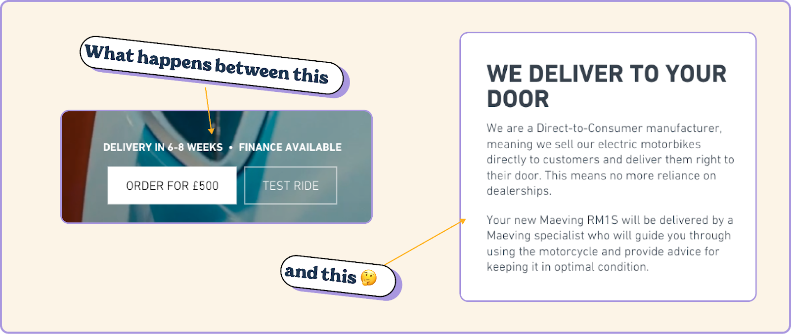
With a delivery time of 6-8 weeks, people want to know why it takes that long for their product to arrive.
So tell them.
You can do this with a simple numbered list or graphic and show them what to expect when they decide to buy from you.
Not only does it help to convince people to buy, it sets expectations for your service and delivery so they won’t be disappointed and leave a bad review.
4. Make it clear how much it’ll cost your customers
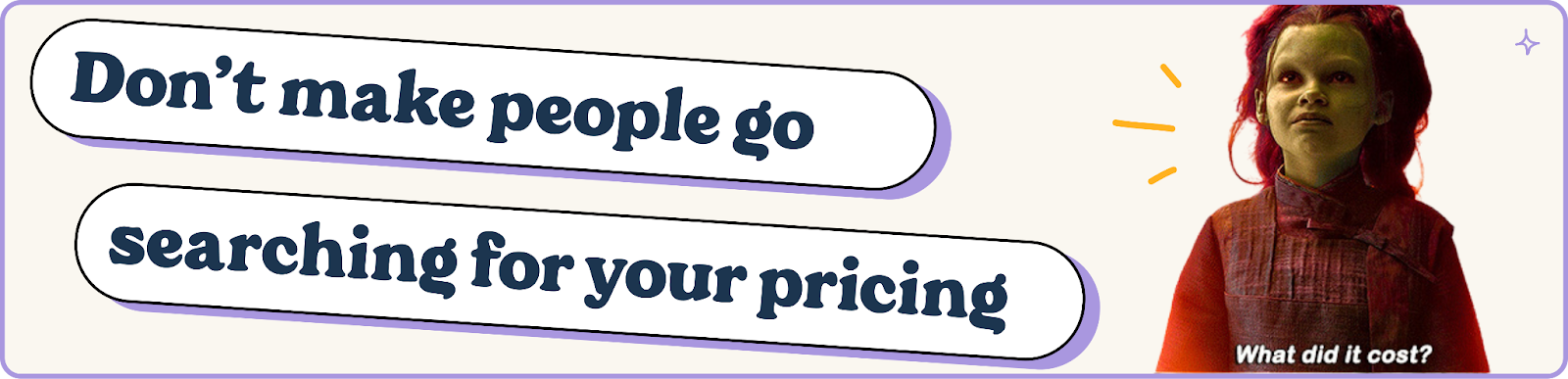
Price is the biggest deciding factors for your customers. Regardless of how good your product is, you need to give them a price straight away.
How many times have you been looking at a product or service online and been left thinking:
HOW MUCH DOES IT COST?
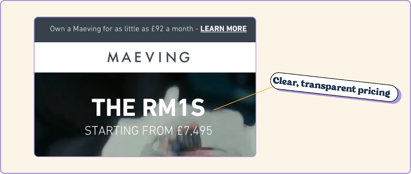
Most landing pages for product get this right. They show the price straight out of the gates like Maeving:
But landing pages for services usually fall short at this point. The price will be vague or not there at all.
“Book a call to find out” or “get a quote” BS doesn’t work for cold traffic.
If you can’t give them an exact number, you at least need to give them an idea of how much it costs. If you’ve got a range of prices, go with something like “Starting from” like Maeving does.
If you don’t give them an idea then they’re going to look somewhere else that has got a price listed.
And if you think the price will put your customers off then you need to make it clear why it’s worth the investment with a clear value proposition and social proof.
And make sure it lines up with your ad. If there’s a increase in price between your ad and your landing page, you’ll miss out on the sale and probably put that person off coming back.
5. Use rock-solid calls to action (CTAs) throughout your landing page
One of the most common mistakes on ad landing pages is not making the most of calls to action. A lot of brands will slap a “buy now” or “learn more” at the top of the page and call it a day.
That’s not going to cut it.
You need to make your calls to action as compelling as possible. With 2-5 words to do that, it’s a bit daunting but once you get into the swing of things it’s not that difficult.
Always start your CTAs with a verb and do more than just encourage people to buy your product or service. Try to sell them a benefit with your CTA.
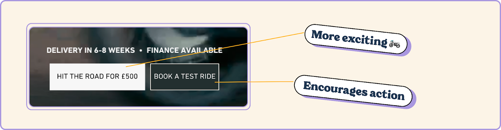
Maeving does a fairly good job with their CTAs:
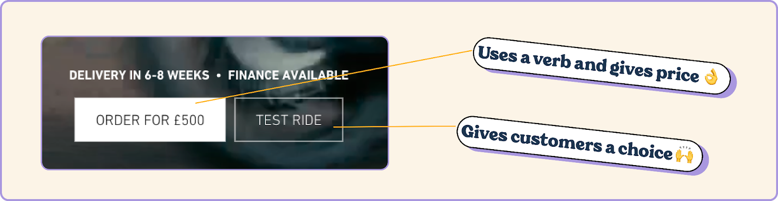
But they’re not all that exciting.
But CTAs don’t just live in your hero section.
You need to use them throughout the page so that customers never have to go looking for a button to take the next step.
Don’t go overboard but try to use CTAs throughout your landing page. And, importantly, use different types of CTAs.
Maeving has three different types of CTA on their landing page:
Buy now
Book a test ride
Learn more
They could definitely add a few more buttons to their page but they’re hitting the three stages that people go through before making a purchase:
Interest — “This seems cool.”
Desire — “I want this.”
Action — “I’m buying it.”
Make sure you use a few different CTAs on your landing page to catch people at different stages.
You might not make an instant sale from the click on your ad but you’ll be able to nurture the lead and make a sale later on.
Check out the difference these 5 landing page elements make to Maeving
Here’s how the Maeving page looked:
Here’s what it looks like with the landing page components we’ve added:
It doesn’t take a whole lot of time or effort to take a landing page “meh” to “hell yeah” and the best bit is that you’ve probably already got the stuff you need.
You just need to bring it front and centre.